Information Architecture (the rebuild)
The original structure had repetition, unclear flow, and sections that didn’t connect. I rebuilt the information architecture from scratch using the business goal as the guide: get understanding fast, then move people toward trying it.
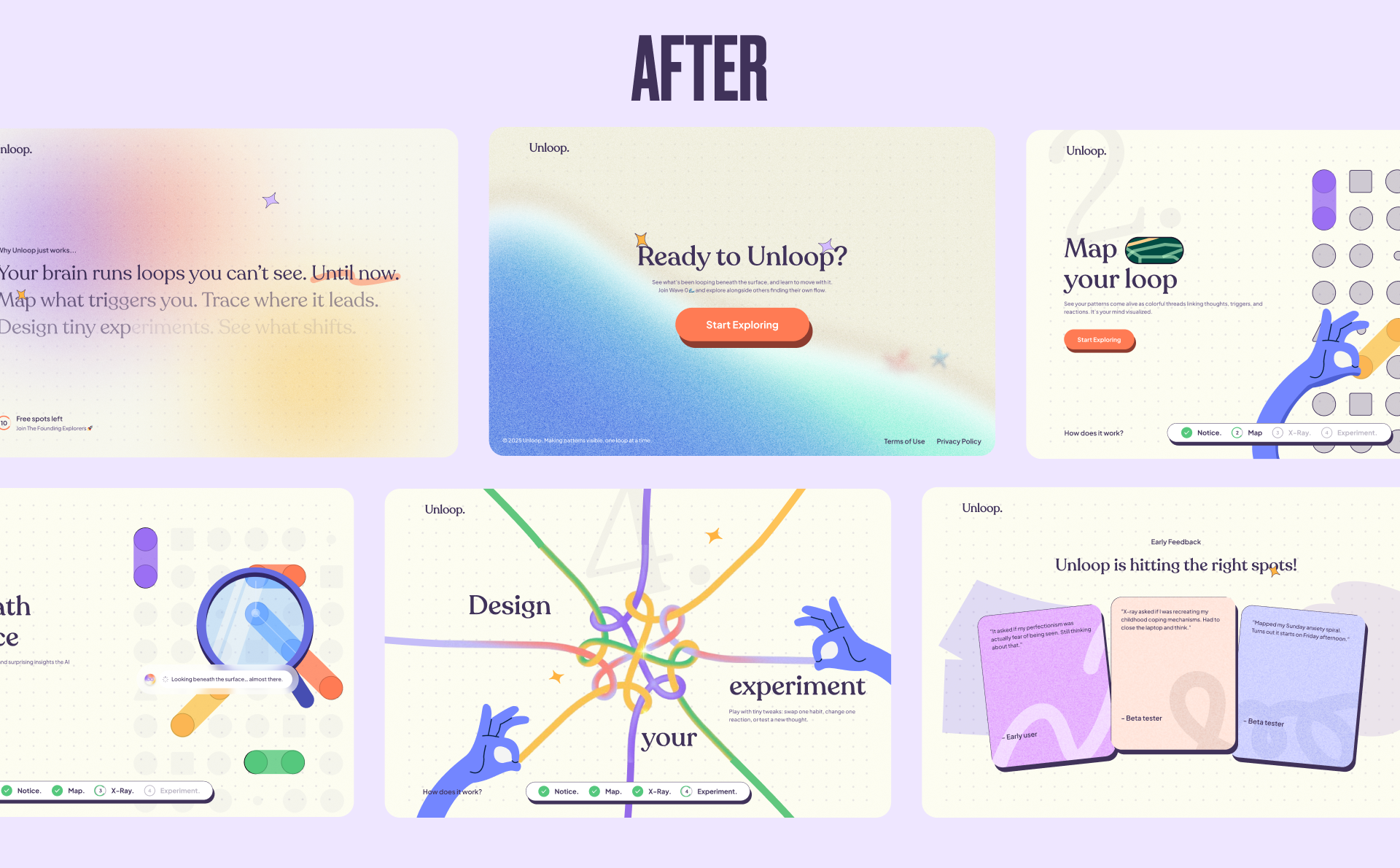
The new flow became: What → How → Social Proof → Questions → Act.
That meant simplifying walls of text into visual storytelling, and adding an FAQ section to address common doubts early and build trust.
-
Hero: “What is this?”
What it needed to do: communicate value in 5 seconds and earn the scroll.
What I designed: a calm, high-clarity hero that pairs a plainspoken headline with a gentle promise before asking for any commitment. -
“How it works”: (show don't tell)
What it needed to do: make the product click without paragraphs.
What I designed: a step-based narrative where the illustration does the explaining—dots become connections, connections become a map, X-Ray reveals hidden links, and a small experiment shifts the outcome.
Social proof (real, specific, believable)
Instead of generic testimonials, I used real early-user moments that show the product doing its job. The quotes are specific enough that visitors instantly understand the value:
- “Mapped my Sunday anxiety spiral. Turns out it starts on Friday afternoon.”
- “It asked if my perfectionism was actually fear of being seen. Still thinking about that.”
- “X-ray asked if I was recreating my childhood coping mechanisms. Had to close the laptop and think.”
That kind of specificity builds trust fast, without hype.
FAQ (trust-building without slowing the momentum)
The FAQ section answers the questions that quietly block conversion:
- What is Unloop, really?
- Is this therapy?
- What about privacy?
It’s written like a thoughtful friend, not a SaaS brochure. The goal is to reduce anxiety and hesitation, not “sell harder.”
Lightweight Brand Foundation (created alongside design)
I added a basic brand layer because the site needed a consistent language for color, type, and motion:
- Palette: rich purple base, coral for curiosity/action, mint for success/relief, warm off-white background.
- Type pairing: humanist serif for warmth + clean sans for clarity.
- Motion rules: slower pacing, subtle easing, celebration moments only at insights/wins.
- Voice rules: conversational, reflective, never prescriptive.
This ensured the landing page wasn’t a one-off “pretty screen,” but the start of a system.
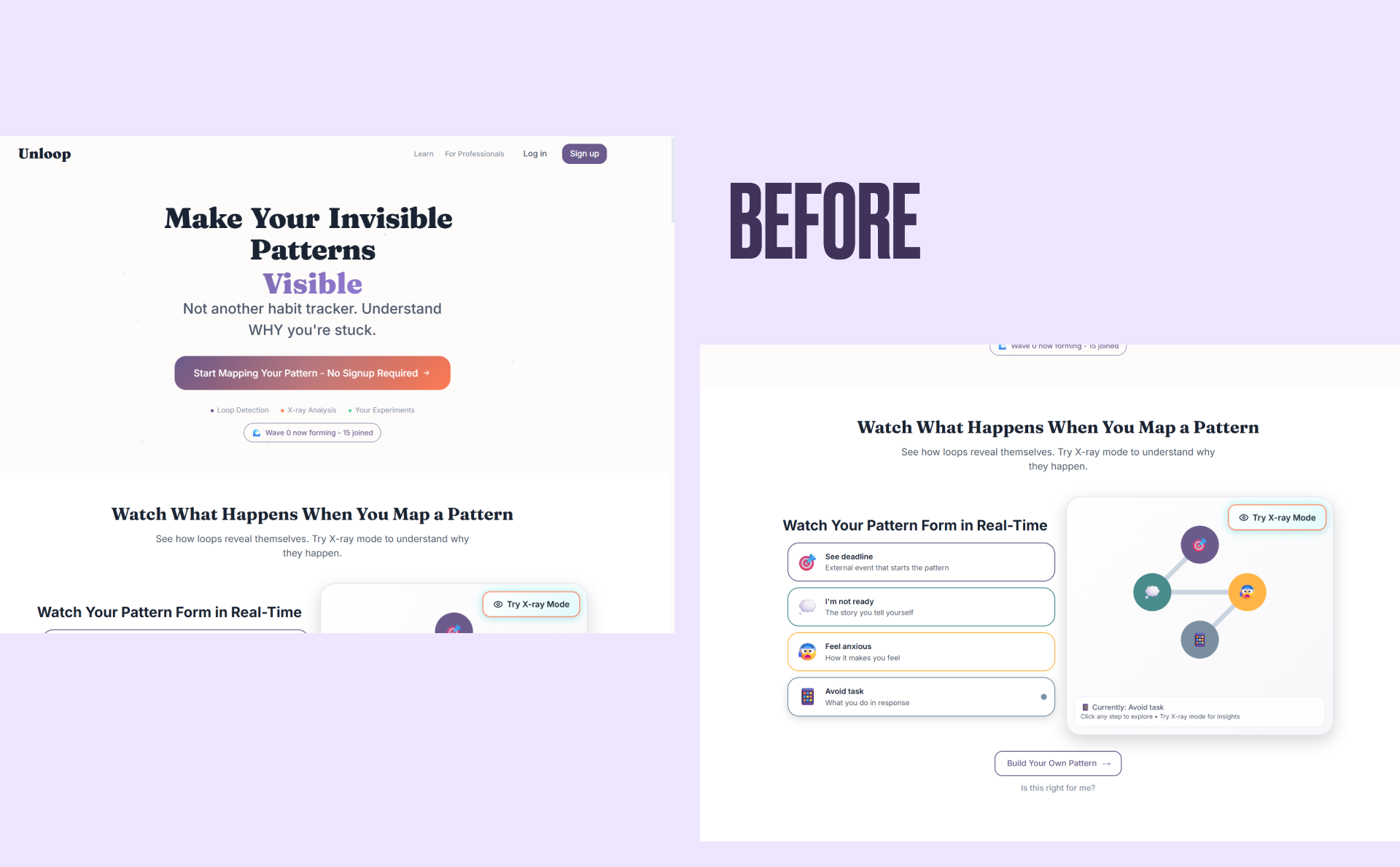
What Changed vs. the Old Page
Before:
- explanation-heavy
- jargon first
- weak emotional framing
- static sections describing an interactive product
After:
- value shown in motion first
- language that invites curiosity, not correction
- story continuity from hero to footer
- a strong “try it now” moment earlier in the page
- social proof that demonstrates the click in real human terms